Colors of the Year for 2023: Neutrals vs. Bold
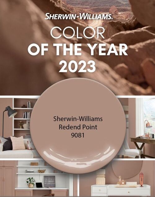
It’s the annual tradition for big-name paint manufacturers to predict what color will be popular this coming year. In the past, both Sherwin Williams and Benjamin Moore have chosen a different shade of light gray green – but it seems they’re going in entirely opposite directions this year! While one company chose a quiet yet contemplative tone called Redend Point which appeals to minimalists, the other has chosen an arrogant Raspberry Blush which would appeal more to maximalists who aren’t afraid to experiment with bold colors.
According to the director of color marketing at Sherwin-Williams, Redend Point symbolizes finding beauty outside oneself. This heartening hue opens minds and hearts to possibilities. It invites compassion and connects people in any space. Homeowners want warmer neutrals with white, beige, pink, and browns being popular choices among consumers.
Wadden suggests, You can also use the hue to decorate your home if you want it to seem more earthy. Try using it with natural-looking textiles and wood accents or make it feel like a desert oasis by layering shades of terracotta and clay.
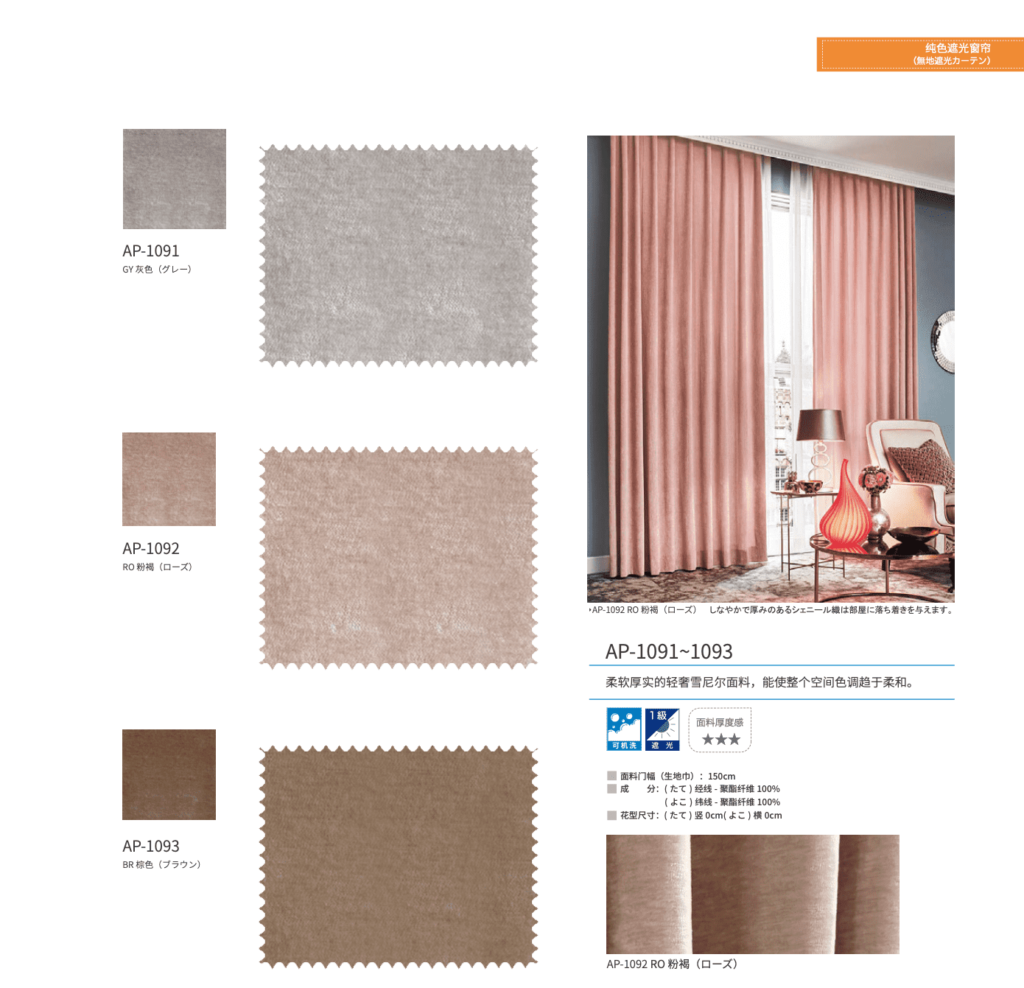
This design style blends well with boho modern homes. Minimalist in design and full of texture from pottery, terracotta tiles, and natural wooden beams; minimalist homeowners love its warm and welcoming neutral look. Our AP Blackout plain collection features an elegant, modern design that is simple looking but great for adding texture to your space. To finish off this look you can add white or natural linen sheer curtains.
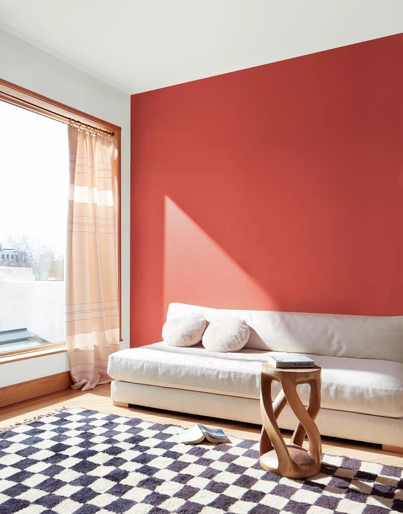
Unlike the subtly chosen color by Sherwin Williams, Benjamin Moore’s pick for the 2023’s Color of the Year is a vibrant orangey red named Raspberry Blush.
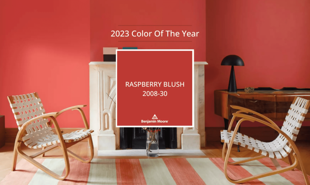
Full-blown and always at the forefront, Raspberry Blush is a bright shade of fiery red and sunburnt orange coral tinted with a vibrant pop of pink to amplify the sense. If you find your motivation twitching from all this heat, it’s no surprise – Raspberry Blush energizes the soul with contagious optimism.
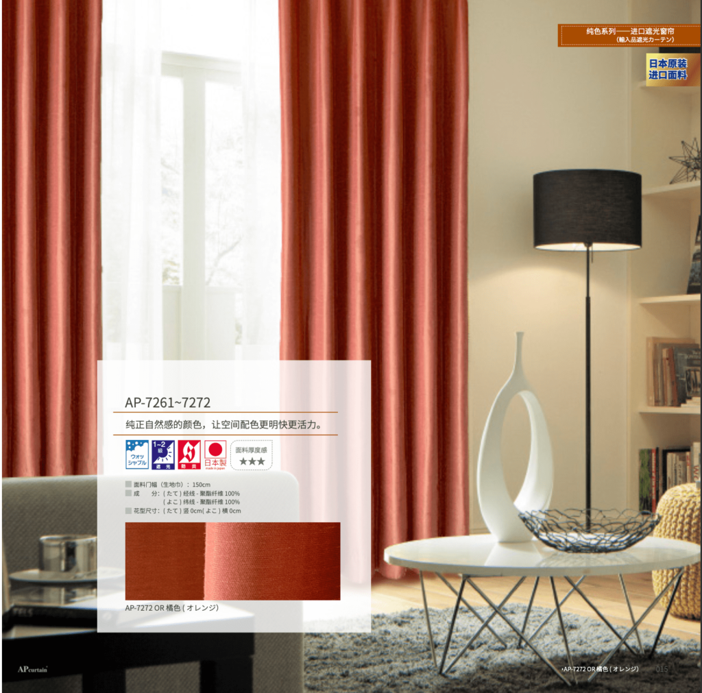
The sensational shade emanates an energetic aura that creates a bright and charismatic appearance when it’s used! After years of neutrals and grays, people are ready to bring color back into their homes, said Andrea Magno, Color Marketing and Development Director at Benjamin Moore. The new Raspberry Blush goes beyond people’s simple comfort zones; it really brings out intense character in one way or another. They want to push boundaries with something out there or ‘off-the-wall’. And what better way than this energizing Raspberry Blush?
For the maximalist, a room enveloped in raspberry blush from top to bottom feels cheerful and striking. If raspberry blush isn’t your color pick, choose small accents like throw pillows or curtains in raspberry blush to make just enough of an impact. Soft grays, whites, and beiges can create the perfect balance against bolder raspberry-hued walls. You can make less of a statement by only painting your kitchen counters or adding some raspberry blush paint to accentuate a specific area.
We understand how important it is for your home to represent who you are and show off the style and colors that make you happy. Your home is a place to express your personality and showcase the colors and décor you love. It should be your happy space! That is why we offer a range of window treatments: from soothing neutrals and minimalist modern roller shades to rich fabrics in bold colors for curtains or roman shades with fun geometric prints.
No matter what your favorite color or design style is, we can make something perfect for you. After all, every project gets treated like an original masterpiece at AP Curtain.

美帘社-logo_确定-051.png)
美帘社-logo_确定-051.png)