Maybe our lives were thrown off track by the pandemic, and disturbed our mood, but we’re still facing tomorrow with big expectations. For the spring season coming up, the color system Morandi will bring hope and comfort to people; it’s been popular at fashion week for years now. You can also find shades of the Morandi color system in interior design colors. Wouldn’t it be nice to have a Morandi-colored home for spring? Why not start by choosing a gorgeous shade of Morandi for your furnishings, cushions, vases or curtains? So, where did the Morandi palette come from?
Portrait of Italian painter Giorgio Morandi Giorgio Morandi (1890 – 1964) is an Italian painter and printmaker specializing in still life sketches. His paintings are striking for their subtlety in depicting clearly simple subjects. He often uses gentle colors, not bright, but extremely close and warm. His paintings are noted for their tonal subtlety in depicting seemingly simple subjects, mostly limited to vases, bottles, bowls, flowers and landscapes.
Morandi color palette
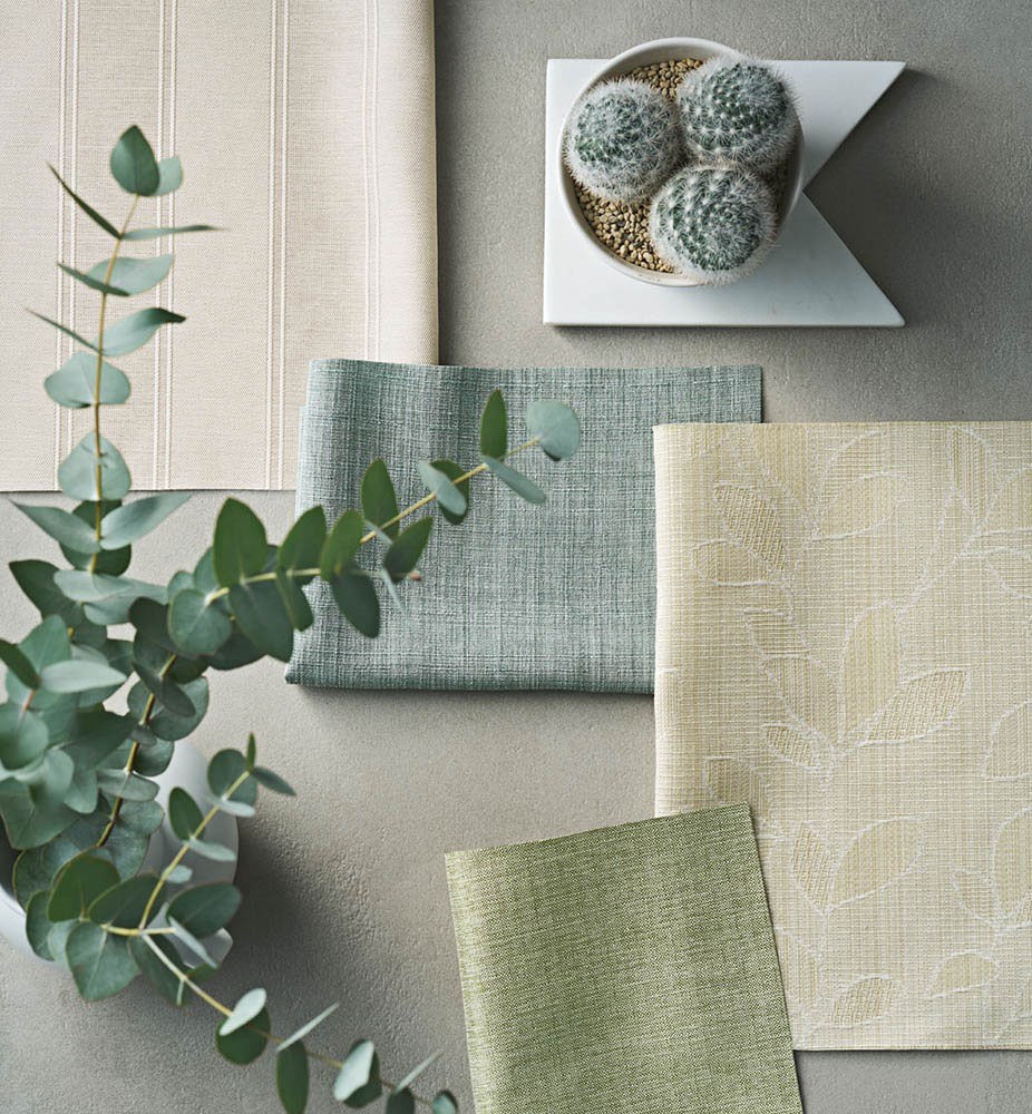
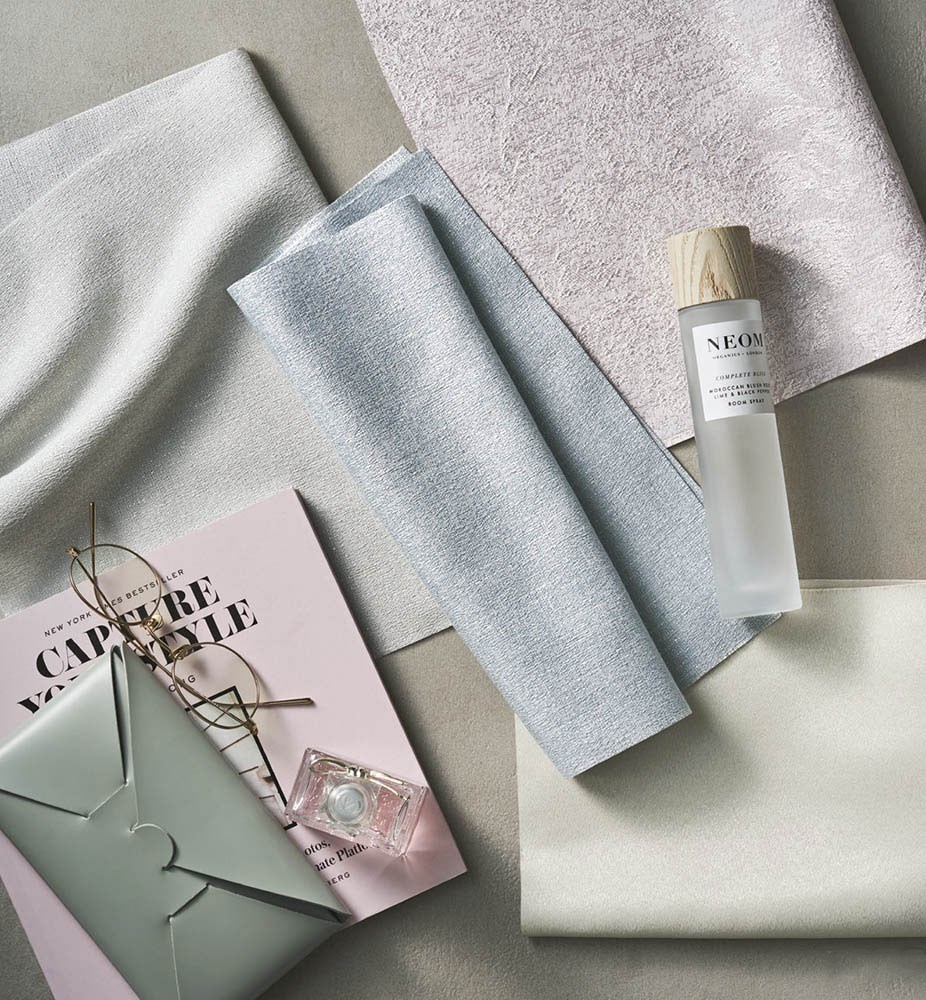
Morandi colors refer to a muted and pale color palette, which is not bright as if covered with a layer of gray tone. The effect of combining colors in the design can make your home extremely simple but equally luxurious. Matching the right colors is often the hardest part of interior design. There are so many shades to choose from and they need to be combined in the right proportions or else it won’t be harmonious. But this was never a problem with Morandi colors. With a wide range of colors on the palette that you can freely mix and match, you don’t have to worry about breaking color rules. The simple interior designs are inspired by Morandi colors. You can also get some ideas from it and build your interior with Morandi color including wall color and curtains. Here are a few suggestions on the curtains design of each color so that you can easily choose the right color for your home’s interior space. We will help you bring a spring atmosphere to your home with the fabulous Morandi color series.
Morandi Gray
Pantone announced it as color of the year 2021 and It is still currently a very trendy color to be used in interior design. If you had a color that was overpowering in your home, you could tone it down by using gray curtains. It works well together and brings the other color out while calming the brightness. Morandi Gray is the right shade of gray to work in your home in a way that feels really warm and compliments the other colors. We may be consciously using gray as a way of protecting ourselves to feel safe and secure. If we’re anxious or nervous, we may also turn to gray to feel calm, which is quite an extreme way to go about it.
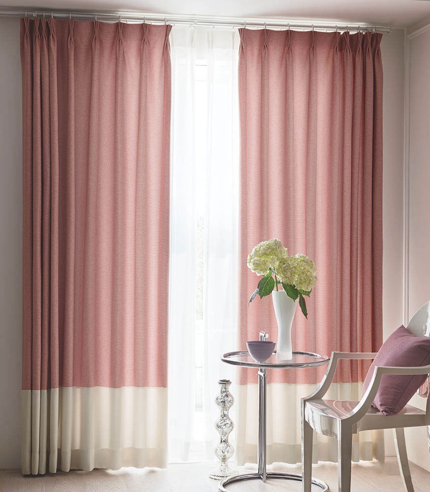
Morandi Pink
Pink seems to be the color that best understands a woman’s heart. It can appropriately express the sense of ritual and atmosphere that every woman craves. Each pink shade remains radiant, showing off their benefits as warm colors all the time. One of the pinks in the Morandi color system is Rose Pink, which clusters together like light-colored roses warming up and caring for each other. The softness of a mature woman and the wiggling of a young one coexist. Low saturation and lightness are hallmarks of flower cluster powder, with the advantage of a low-key and elegant – get rid of gender restrictions.
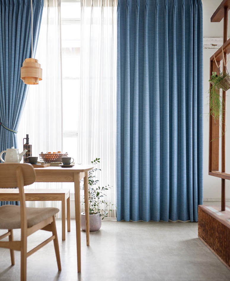
Morandi Blue
Morandi blue is a shade of pale sky blue – often used in home color matching, and when seeing this shade it gives off an illusion of having a large field of view, as if the sky is moving right in front of us. The brightness of the light blue is high, and gray is added to the light blue to adjust the brightness. It also has an airy, low-key feel, which is also a typical feature of the Morandi color system.
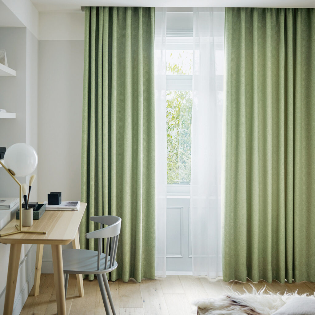
Morandi Green
Their earthy green tone brings nature’s calming feel indoors too, so the great outdoors isn’t totally forgotten. Green is friendly to nature and full of the breath of a fresh garden. Fresh but not dazzling, but extremely cool. Morandi Green shade represents fertility, growth, calmness and good health. Green curtains are destined to make your home interiors radiate positive energy. It also set a calm and peaceful vibe. Morandi Green is an elegant choice especially if it is combined to a more intense green or to wooden furniture.
Take steps towards spring and bring some Morandi color to your home.
The new, spring-themed curtains are a beautiful way to welcome in the season. If you’re thinking about updating your curtains or blinds, keep it light, muted and simple. We have a variety of Morandi color collections to choose from and our highly experienced consultants will offer you the best advice too. Get in touch with AP Curtain today for more information or a free quote.